There are dark spots in Montana’s history. One in particular haunts me. A 2001 survey by the North American Vexillogical Association (more on them in a second) found that Montana’s state flag was the third-worst state flag in all of North America. Now, 2001 was basically a geologic age ago, but the survey was recently thrust back into the limelight on an episode of Mike Rowe’s Someone’s Got to Do It. And now we need to talk about Montana’s flag. In case you were wondering, this is Montana’s official state flag:

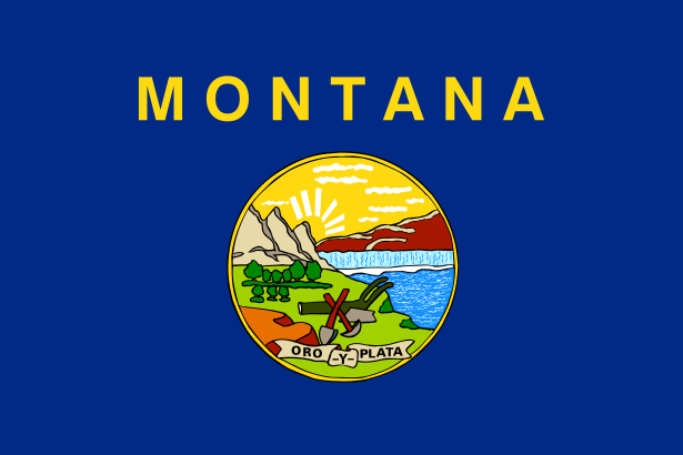
Wait. That’s not it? Oh, right. Here’s the offending banner:

The state seal on a blue field, with the word “Montana” helpfully written across the top. Simple, elegant, refined. As a proud University of Montana alumnus, I object to the color scheme, but only a little. So the question is, how did our flag get beat out by flags like this?

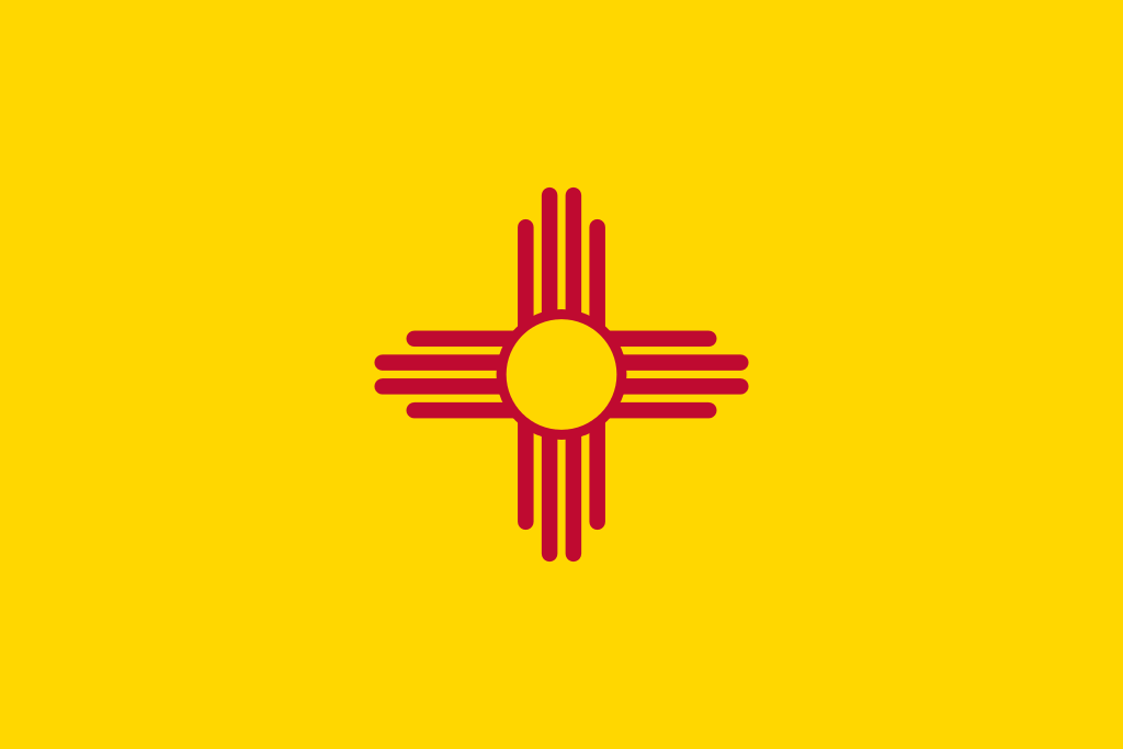
What state does that represent? I don’t know, because the flag doesn’t say.
The North American Vexillogical Association (vexillology is the study of flags) lists five guidelines for making a good flag: 1) Keep it simple, 2) Include meaningful symbolism 3) Stick to 2 or 3 basic colors, 4) No lettering or seals, 5) Keep it distinct and relevant.
Now, if you are anything like me, you were reading that list thinking we did pretty good, until you got to number 4, which really stomps on our flag. NAVA explains that when you see a flag, it is almost always either flapping in the wind, or hanging limp on the flag pole. Either way, letters and the details inside seals get lost in the folds. NAVA, apparently, has never been to Livingston, where the wind blows so hard that the flags look like they’ve been starched.
As for number 5, Ted Kaye, a NAVA stooge (and flag expert), says that “nearly half of our state flags sport a seal on a blue field,” making them nearly impossible to tell apart. Clearly a bunch of states copied Montana.
A version of our state flag first appeared on the uniforms of Montana Volunteers during the Spanish-American War, in 1898. After that, it was informally used as the state flag until 1905 when state representatives made it official. The word “Montana” first appeared on the flag in the 1980s, presumably to distinguish it from the rest of the seal-on-blue crowd (but also because Montanans really like to remind everyone how to spell the state name).
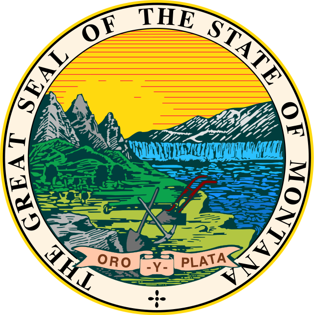
The seal in the middle dates back to the first territorial legislature and is pretty darn cool. It incorporates the varying geography of the state and makes reference to the our primary industries. The Secretary of State’s website has an excellent article about the history of the seal. Admittedly, you can’t absorb much of the seal’s rich history and symbolism when it is flapping in a 26 mph wind 20 feet over your head, but that is hardly the point.

In sum, NAVA or no NAVA, I like our state flag. It has excellent symbolism, a great history, it helps me spell, the blue is nice, and it is classier than a cow skull on a fence post, which was (probably) the other option.
What do you think of Montana’s state flag? Classy? Cheesy? What would you suggest? Let us know in the comments.
